Executive Summary
The yield curve is one of the most closely watched indicators in fixed income markets and one of the most systematically misunderstood by the investors who need it most. Most people know that an inverted yield curve can warn of recession risk. What deserves equal attention is what happens when the curve returns to a positive slope: normalization is not necessarily an all-clear.
A particularly risky phase can follow a rapid return to a positive slope, a process called de-inversion, when falling short-term yields reflect expectations of aggressive rate cuts in response to economic or financial stress. But steepening has more than one cause; it does not by itself establish that something has broken in the financial system.
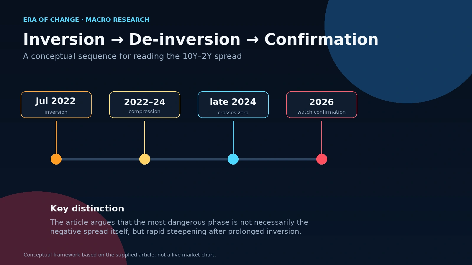
That matters in ways the current environment makes especially concrete. The FRED daily 10-year/2-year series first turned negative on July 6, 2022 (July 5 was 0.00) and last showed a negative reading on September 5, 2024. Counting both dates gives a 793-calendar-day first-to-last span, but the spread reached zero or positive readings on August 27–30 and September 4 within that interval, so it was not continuously negative for 793 days. Post-COVID excess liquidity stretched the transmission mechanism. Corporations had locked in cheap debt at historically low rates, insulating themselves from the full impact of tight monetary policy. Source. Source 2.
But that insulation may be expiring. The curve has de-inverted. As of mid-June 2026, the 10Y-2Y spread sits at approximately positive 29 to 53 basis points. Past cycles suggest that the period after de-inversion can carry elevated risk, especially when steepening reflects rapid policy cuts. The historical sample is limited and outcomes vary, so this is a warning to monitor alongside credit, labor, and liquidity conditions, not a reliable calendar for market dislocations. Understanding why is what this article is about.
Introduction
Most investors hold one simplified mental model of the yield curve: inverted curve equals incoming recession. See the inversion, brace for impact. They watched the 2022 inversion arrive, watched the economy fail to collapse on schedule, and started revising their view. "Maybe it's different this time," they said. "Maybe the indicator doesn't work anymore."
That conclusion may be wrong. The yield curve signal may not have failed; the transmission mechanism could have slowed for specific structural reasons while the underlying pressure continued. The 2022–24 episode had a 793-calendar-day first-to-last-negative span, but it included zero or positive readings and was not continuously inverted for that full period. As the curve has de-inverted, investors should consider what can follow while recognizing that historical timing and outcomes vary.
I pay particular attention to de-inversion rather than treating it as an automatic all-clear. A sustained return to a positive slope is a reason to examine what has changed in policy expectations, credit conditions, and growth. It is a warning to investigate, not a standalone crisis signal.
What Is the Yield Curve?
The yield curve is a graph that plots the interest rates, yields, of US Treasury securities across different maturity dates, from one month out to thirty years. Treasury securities are debt instruments issued by the US government. When you buy a 2-year Treasury, you are lending money to the US government for two years and receiving a fixed interest payment in return. When you buy a 10-year Treasury, the same applies but across a decade.
Under normal conditions, longer-term bonds yield more than shorter-term ones. This makes intuitive sense: if you are tying up your money for ten years rather than two, you expect to be compensated for the additional time, the additional uncertainty, and the additional inflation risk that comes with a longer commitment. The result is a yield curve that slopes upward from left to right: short maturities on the left yielding less, long maturities on the right yielding more. This is the baseline. This is what a healthy, forward-looking economy looks like in the bond market.
What the yield curve actually captures, beneath the surface, is the bond market's collective assessment of where interest rates and economic growth are likely to be over different time horizons. The short end is heavily influenced by current central bank policy: the Fed sets the overnight rate, and short-term Treasury yields follow closely. The long end reflects the market's forecast of future growth, inflation, and the long-term neutral rate. When those two assessments diverge sharply from their historical relationship, the curve tells you something structurally important is happening.
Why Does the Yield Curve Matter?
The bond market is not just larger than the equity market. It is older, it operates on longer time horizons, and it is dominated by institutional capital: pension funds, sovereign wealth funds, insurance companies, and banks that do their analysis with far more resources and with far less tolerance for sentiment-driven positioning than the average equity participant. When something significant is moving in Treasury markets, it is generally because the largest, most informed pools of capital in the world have formed a view and are acting on it.
This is why the yield curve tends to lead the stock market rather than follow it. The Federal Reserve Bank of New York's research on the yield curve as a leading indicator has documented this relationship across decades: the shape of the yield curve contains significant forward-looking information about economic conditions that equity markets have historically been slow to price. When the bond market is expressing concern through the shape of the curve: equity markets often do not register that concern for months.
What Is an Inverted Yield Curve?
An inverted yield curve occurs when short-term yields exceed long-term yields, when the curve slopes downward rather than upward. The most widely watched version of this is the spread between 10-year Treasury yields and 2-year Treasury yields, known as the 10Y-2Y spread. When this spread goes negative, when a 2-year Treasury yields more than a 10-year Treasury, the curve is inverted.
Why is this unusual? Because investors who tie up money for ten years should, under any rational framework, demand more compensation than investors who tie it up for two. When they accept less, it tells you that they expect interest rates to fall materially over the next decade, which is typically only true when they expect the economy to weaken significantly and the Federal Reserve to cut rates in response. Inversion is the bond market collectively saying: current policy rates are too high for the economic trajectory that we believe is coming.
The spread itself is elegantly simple as an instrument to follow. When the number is positive, the curve is normally shaped. When it is negative, it is inverted. The magnitude tells you the severity of the signal. The direction of change tells you whether stress is building or receding.
Why Does an Inverted Yield Curve Predict Recessions?
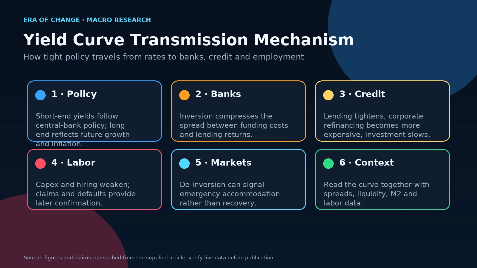
The mechanics run through the banking system, and they are more direct than most investors realize.
Banks operate on a fundamental business model: they borrow at short-term rates through customer deposits, commercial paper, and interbank funding and lend at long-term rates through mortgages, corporate loans, and consumer credit. The spread between those two rates is their net interest margin, the primary source of their profitability.
When the yield curve inverts and short-term rates exceed long-term rates, this business model compresses. Banks can no longer earn a meaningful spread between what they pay to borrow and what they receive to lend. Their incentive to extend new credit diminishes. Lending tightens. Credit creation slows. Businesses that depend on credit for investment, expansion, and working capital find it more expensive and less available. Economic activity follows.
The mechanism does not work instantaneously. It works through the gradual accumulation of credit tightening across an economy where millions of businesses and households are simultaneously experiencing marginally tighter conditions. That accumulation takes time to translate into the economic data and then more time before the NBER officially dates the turning point. The Cleveland Fed's research on the yield curve and GDP and the New York Fed's leading indicator model both document this forward-looking relationship with statistical precision.
Treasury yield-curve inversions have often preceded U.S. recessions, but the result depends on the spread, threshold, episode definition, and forecast horizon. An inversion does not determine whether or when a recession will begin. The New York Fed's published recession-probability model uses the 10-year/3-month spread and a 12-month forecast horizon; it is distinct from the 10-year/2-year spread discussed here. Source. Source 2. Source 3.
Has the Yield Curve Ever Been Wrong?
I want to be honest about this because the answer matters for how you calibrate the signal, and intellectual honesty about a framework's limitations is inseparable from using it credibly.
The FRED 10-year/2-year daily series records brief negative readings in July 1998; no NBER recession began within the following 12 months, although a recession began in March 2001. Because the FRED T10Y2Y series begins in 1976, it cannot verify a 1966 episode. Whether an episode is called a false signal depends on the spread, threshold, and forecast horizon. Source. Source 2.
A yield-curve inversion is a risk signal, not a recession date or guarantee. Whether an episode counts as a false signal depends on the spread, threshold, and forecast horizon. The 2022–24 episode also illustrates why the exact inversion dates and transmission lag matter. Source. Source 2.
Why the Post-COVID Cycle Is Different and More Dangerous
Most analysts who followed the 2022 inversion made the same mistake. They saw the inverted curve, watched the economy absorb it without immediate collapse, and concluded the indicator had lost its predictive power. The economy was different now. The signal was broken.
What they missed is a structural feature of the post-COVID period that had nothing to do with the yield curve being wrong and everything to do with how quickly the credit tightening would transmit.
In 2020 and 2021, an unprecedented volume of liquidity entered the financial system through a combination of Federal Reserve balance sheet expansion and direct fiscal transfers. Corporations did exactly what rational actors would do when given access to historically cheap capital: they refinanced their existing debt at near-zero rates and extended their maturities as far forward as possible. They locked in cheap funding for years. When the curve inverted in July 2022, companies were not immediately dependent on rolling short-term debt at higher rates. They were living on the debt they had already issued, at rates that bore no relationship to the current funding environment.
In our interpretation, the pressure was building while the shock absorbers of accumulated cheap debt were still functioning. Companies that had locked in low fixed rates were partly insulated. Research on the corporate debt maturity wall describes how borrowers refinancing maturing fixed-rate debt can face higher interest costs when replacement financing is more expensive; the exposure varies by market, borrower, and debt structure. Our thesis is that refinancing can reveal pressure previously deferred by cheap funding. A delayed impact is compatible with that thesis, but does not prove by itself that the original yield-curve warning was correct.
My view is that the yield-curve warning has not become irrelevant: post-COVID funding buffers may have slowed the transmission of tighter policy rather than eliminated it. As cheap fixed-rate debt matures, higher refinancing costs could amplify pressure on corporate profitability. That is a scenario I take seriously, not a claim that this cycle must be harsher than every previous one. Its severity depends on borrowers' cash flows, debt structures, and the rates available when they refinance.
The Most Misunderstood Signal: De-Inversion
This is the section of the yield curve debate that almost no mainstream financial commentary addresses correctly, and it is the part I believe matters most for investor positioning right now.
Most investors have been taught to watch for inversion, and some treat a return to a normal curve as the all-clear. That reading can miss an important risk. Some past cycles have seen severe equity drawdowns and economic deterioration after de-inversion, particularly when steepening reflected a worsening outlook and policy easing. This is a pattern to assess in context, not a universal sequence or a reliable timetable for the next downturn.
One mechanism worth understanding is the bull steepener. It helps explain why I treat some episodes of de-inversion as a warning to investigate, rather than automatically reading normalization as a resolution of risk.
A bull steepener occurs when short-term yields fall faster than long-term yields. In the stress scenario I am monitoring, the short end falls as markets price rapid Federal Reserve easing in response to deteriorating conditions, while longer-term yields decline less because inflation or fiscal concerns limit the move. The curve can then become positive without the economy having recovered. But this is one possible mechanism: expected disinflation, a softer growth outlook, or other changes in policy expectations can also produce a bull steepener without a financial-system break.
Some past cycles show that equity-market peaks and large drawdowns can occur after a yield curve re-steepens, but timing and causes vary. In 2007, for example, the S&P 500 continued to make new highs after an initial de-inversion before the Global Financial Crisis bear market began. That episode is an illustration, not proof that every de-inversion signals emergency policy or an imminent downturn. A rapid bull steepener driven by rate cuts may be a reason to examine credit and labor data more closely; the curve alone does not confirm that the transmission mechanism has broken.
The One Yield Curve Signal Every Investor Should Watch
I am not suggesting that every investor needs a Bloomberg terminal and a three-dimensional bond market model. The practical intelligence embedded in the yield curve is accessible through a single number, tracked on a single chart, interpreted through a single event.
Track the 10-year/2-year Treasury spread on FRED.
The number you want to understand is zero.
While the spread is negative, while the curve is inverted, the system is under stress but absorbing it. The inversion is the compression phase. The spring is coiling. During this phase, the signal says: something structural is building. Position defensively. Reduce leverage. Do not add risk.
The event I watch is a sustained move of the spread from negative to positive after a prolonged inversion, not a brief flicker around zero. In some past cycles, that transition has occurred alongside policy easing, high-yield spread widening, and a weakening labor market. Those accompanying conditions matter: crossing zero alone does not establish that the Fed is in emergency mode or that unemployment will accelerate.
The daily 10Y-2Y spread first reached zero on August 27, 2024, then fluctuated around zero: it was positive on August 28, zero on August 29–30, negative on September 3, positive on September 4, negative on September 5, and positive on September 6. The first-to-last-negative calendar span was 793 days inclusive, not a continuous 793-day inversion. As of mid-June 2026, the spread sits at approximately positive 29 to 53 basis points. The transition has already occurred. In our assessment, this makes the surrounding credit, labor, and liquidity conditions especially important to monitor; it does not establish a fixed window for recession or market losses. Source.
What the Yield Curve Says About Today's Economy
I want to be precise about the current environment, because the combination of indicators visible today is not ambiguous.
The 2022–24 10Y-2Y episode covered a 793-calendar-day span from the first negative daily observation (July 6, 2022) to the last (September 5, 2024), including several zero or positive readings near the end. Lead times between yield-curve signals and recessions vary; this historical span alone does not establish a recession date or prove when transmission effects will occur. Era's view is that post-COVID liquidity buffers may have delayed transmission. Source. Source 2.
The curve has de-inverted. The corporate debt maturity wall, approximately $2.5 trillion in global maturities concentrated in 2025 to 2027, is actively hitting the refinancing market at rates materially higher than those at which the debt was originally issued. Credit spreads have widened significantly from their post-pandemic lows. Initial jobless claims are running at a level that, in context of the broader indicator framework, warrants close monitoring. The Era Global Risk Index currently reads 69 out of 100, reflecting simultaneous deterioration across monetary policy, credit, and geopolitical categories, not a single flashing signal.
The yield curve alone does not make a case. Nothing in macroeconomics should ever rest on a single indicator. But the yield curve combined with the current reading of credit markets, liquidity conditions, and the corporate refinancing calendar produces a picture that is coherent and structurally concerning. The spring that was compressing through 2022, 2023, and 2024 is now releasing.
How Era Uses the Yield Curve
The yield curve is one component of our structural analysis framework, specifically within the monetary policy and credit categories of the Era Global Risk Index. We do not use it as a binary on/off switch. We track it as a continuous structural signal, weighting its contribution dynamically based on its deviation from historical norms and its interaction with other indicators.
What the yield curve tells you alone has limits. An inverted curve with tight credit spreads, low unemployment, and strong M2 growth tells a different story than the same inverted curve with widening high-yield spreads, rising initial claims, and a contracting China Credit Impulse. The signal's significance is always contextual. It is one voice in a conversation among 24 structural indicators, not a verdict rendered in isolation.
Our approach weights the yield curve's contribution more heavily when it is deteriorating simultaneously with credit market stress, interbank liquidity pressure, and capital flow dynamics. That configuration, which is what the current environment reflects, is the one that has historically preceded the most significant market dislocations. One flashing light can be noise. Multiple structural indicators deteriorating together is a pattern.
What Investors Should Watch Next
Given where the yield curve currently sits and what the structural context around it looks like, the indicators most worth monitoring over the next twelve months are these.
The 10Y-2Y spread itself remains the primary real-time gauge. At the article's mid-June 2026 observation of positive 29 to 53 basis points, the curve was normalizing but not yet steeply positive. A rapid steepening driven by falling short-term yields could reflect expectations of policy easing and deserves close attention. It would not, on its own, confirm a structural break; credit and labor indicators would need to support that reading. The FRED T10Y2Y chart is a useful series to bookmark.
High-yield credit spreads are the secondary confirmation signal. When corporate borrowing costs above the risk-free rate widen materially, the credit market is pricing default risk in real time. Combined with yield curve de-inversion, widening high-yield spreads have historically confirmed the structural deterioration that the curve first signaled.
Funding-market spreads can provide additional evidence of liquidity stress, but each measure requires a defined benchmark, maturity and calculation method. SOFR is a secured overnight rate and should not be treated as a direct measure of unsecured interbank lending. A rapidly steepening yield curve should be assessed alongside clearly specified funding-market indicators rather than treated as a sufficient signal on its own. Source.
Initial jobless claims, specifically the four-week moving average and its trajectory, are the labor market early warning system. The yield curve predicts; the labor data confirms. Watch for the four-week average sustaining above 250,000 as the threshold that matters.
And the corporate default rate, which typically lags high-yield spread widening by 9 to 12 months, is the lagging confirmation that the structural pressure visible in the credit markets is arriving in actual balance sheet damage. We are not yet at elevated default rates, but the forward calendar of debt maturities makes this worth monitoring weekly, not quarterly.
No single indicator is sufficient. What you are looking for is the convergence of multiple structural signals pointing in the same direction, the same discipline that the Era Global Risk Index was designed to operationalize.
Frequently Asked Questions
What is the yield curve?
The yield curve is a graph that plots the yields of US Treasury securities across different maturities, from short-term bills to long-term bonds. Under normal conditions it slopes upward investors demand higher yields for longer-term lending. The shape of the curve encodes the bond market's collective expectations about economic growth, inflation, and central bank policy over different time horizons.
Why does the yield curve invert?
Inversion occurs when short-term Treasury yields exceed long-term yields, when the 2-year yield rises above the 10-year yield. This happens when the Federal Reserve has raised short-term policy rates aggressively, while bond markets simultaneously expect that growth will slow enough in the future to require rate cuts. The inversion reflects a tension between tight current policy and a pessimistic forward economic outlook.
Does an inverted yield curve always mean a recession?
Yield-curve inversions have often preceded U.S. recessions, but timing varies and the signal is not a precise calendar. Historical performance depends on the spread, threshold, episode definition, and forecast horizon; the New York Fed's recession-probability model, for example, uses the 10-year/3-month spread over a 12-month horizon. Source. Source 2. Source 3.
What is the 10Y-2Y spread?
The 10-year/2-year Treasury spread is the difference between the yield on a 10-year US Treasury note and a 2-year Treasury note. When positive, the curve is normally sloped. When negative, it is inverted. This is the most widely watched single measure of yield curve shape among institutional investors and market analysts.
Why do investors monitor Treasury yields?
Treasury yields are the benchmark for the cost of risk-free capital in the US financial system. Every other interest rate (corporate bonds, mortgages, bank loans, credit cards) prices at a spread above Treasuries. Changes in Treasury yields ripple through the entire credit structure of the economy. Institutional investors, banks, and policymakers monitor Treasury markets as the primary real-time readout of financial system conditions.
What is yield curve de-inversion?
De-inversion, or re-steepening, occurs when an inverted yield curve returns to a positive slope when the 10Y-2Y spread crosses back above zero. This can happen through a “bull steepener,” where short-term yields fall faster than long-term yields, sometimes because markets expect rate cuts or because the Federal Reserve responds to economic or financial stress. In some past cycles, this transition has coincided with significant equity drawdowns, but it does not reliably time them and should be read alongside other indicators.
What happens after the yield curve returns to normal?
Some past episodes of prolonged inversion have been followed by economic or market stress, particularly when re-steepening reflected rapid policy cuts. However, de-inversion alone does not confirm that structural deterioration has arrived or that central-bank intervention is required. The cause of the steepening and evidence from credit, labor, and funding markets need to be assessed separately.
Is the yield curve still reliable after COVID?
The yield curve did not fail during the post-COVID cycle. The transmission mechanism slowed because an unprecedented volume of cheap fixed-rate debt insulated corporations from the immediate impact of rate tightening, but the structural relationship between prolonged inversion and economic deterioration has not changed. The first-to-last-negative span of the 2022–24 episode was 793 calendar days inclusive, although the spread briefly reached zero or positive readings within that period. Era's analysis is that refinancing of debt issued in 2020–21 may be one channel through which earlier tightening continues to affect borrowers. Source.
About E.R.A. OF CHANGES
E.R.A. OF CHANGES is an independent macroeconomic research and geopolitical intelligence firm providing institutional-quality analysis to investors worldwide. Our research combines macroeconomics, financial markets, blockchain analytics, and geopolitical risk into proprietary forecasting frameworks designed to identify structural market trends before they become consensus.
The Era Global Risk Index, updated daily from 24 structural indicators, serves as the foundation of our analytical methodology, providing a forward-looking measure of systemic financial stress grounded in structural economic evidence rather than market sentiment. Our full methodology, live index reading, and forecast archive are available at eraperemen.info/en.
The content published by E.R.A. OF CHANGES is for informational and educational purposes only and does not constitute financial, investment, legal, or tax advice. All views expressed are the personal analytical perspective of the author. Past forecast accuracy does not guarantee future results. Readers should conduct their own research and consult a qualified financial professional before making any investment decisions.
Sources
- Federal Reserve Bank of New York: The Yield Curve as a Leading Indicator — FAQ
- Cleveland Fed: Yield Curve and Predicted GDP Growth
- FRED: 10-Year Treasury Constant Maturity Minus 2-Year Treasury Constant Maturity (T10Y2Y)
- FRED: ICE BofA US High Yield Index Option-Adjusted Spread
- NBER: Business Cycle Dating Committee
- Lambda Finance: Yield Curve Inversion and Recession Lead Time (1978–2026)
- Bravos Research: The Most Dangerous Yield Curve Inversion in History
- Potato Capital Research: Yield Curve Un-Inverts — What the Steepening Means for Markets
- AInvest: Global Debt Surge and the 2026 Refinancing Crisis
- Hartford Funds: What the Shape-Shifting Yield Curve Is Telling Us