Executive Summary
Every month investors are hit with GDP, CPI, payrolls, PMI, retail sales, housing starts, consumer confidence, and dozens of financial-market signals. The problem is not a shortage of data. The problem is that most of the data investors watch most closely describes where the economy has already been, not where it is going.
Era of Change prioritizes a specific set of leading economic indicators: signals that tend to shift before official statistics catch up, before earnings begin to miss, and before central banks formally acknowledge a change in regime. Nikolai Fainizky’s highest-priority indicator for the next six months is global liquidity: the combined trajectory of major central-bank balance sheets and Federal Reserve liquidity facilities. Liquidity is the variable that drives equity multiples and crypto valuations at the system level. When it contracts, even companies with strong fundamentals can face multiple compression.
A second underappreciated warning signal is the combination of high-yield credit spreads and the MOVE Index (bond-market volatility). When these two move together in the same direction, the credit transmission mechanism may be breaking before the damage reaches equity prices or official GDP data.
Era also tracks initial jobless claims, the yield curve, and real interest rates as part of a five-indicator macro dashboard. CPI, by contrast, gets less forward-looking weight from Era than it receives from most investors, not because it is unimportant, but because it is primarily a lagging description of prices that have already changed.
Key Takeaways
- The best leading indicators measure financial transmission, not headline economic outcomes.
- Era’s highest-priority macro indicator for the next six months is global liquidity.
- High-yield credit spreads can reveal credit-mechanism stress before major equity indices fully react.
- The MOVE Index (bond-market volatility) provides important confirmation when combined with widening spreads.
- Initial jobless claims give high-frequency weekly visibility into labor deterioration earlier than the unemployment rate.
- The yield curve is useful, but the re-steepening after inversion can be as significant as the inversion itself.
- Real interest rates measure the true cost of capital, which is more informative than the nominal policy rate alone.
- CPI is enormously market-moving but is primarily a lagging description of price changes that have already occurred.
- No single indicator should drive a market view; the strongest signals appear when several independent indicators deteriorate simultaneously.
Why Most Economic Data Arrives Too Late
Every month investors receive a compressed set of signal and noise: GDP estimates revised two quarters after the fact, unemployment rates that lag hiring behavior by four to six weeks, CPI prints that describe prices measured in the previous thirty days and processed through a statistical methodology that can introduce additional delay.
Markets, meanwhile, do not wait. They anticipate. By the time GDP confirms a technical recession, equity markets have typically already discounted a significant portion of the damage. By the time the unemployment rate breaks above 5%, early jobless-claims data has often been signaling deterioration for three to four months. The rear-view mirror of macroeconomics (the lagging statistics that dominate financial media) is, structurally, the wrong set of instruments for investors trying to position ahead of a regime change.
This is not an original observation. But translating it into a practical monitoring framework (specifying which five indicators to watch, in which order, and what combination of signals constitutes a genuine warning) is where most financial education falls short.
What Is a Leading Economic Indicator?
A leading economic indicator is a data series or market variable that tends to change direction before broader economic activity, employment, credit conditions, or asset prices reach an important turning point. It does not need to be perfectly predictive. It needs to provide useful information earlier than the alternatives.
The critical limitation to state upfront: “leading” does not mean infallible. Indicators can lead by different amounts of time across cycles, produce false signals, lose predictive value when policy changes structurally, and behave differently depending on the economic regime. The Federal Reserve’s September 2026 rate hike occurred in an environment where the 10-year TIPS yield was already at 2.63%, near an 18-year high. The historical lead times embedded in yield-curve inversions were distorted by the unusual post-COVID monetary expansion and subsequent tightening. Frameworks that worked reliably from 2000 to 2019 require recalibration for the current regime.
The honest approach is to use leading indicators as one layer of a forecasting framework, not as automatic sell or buy signals.
Leading vs. Lagging: A Framework
Leading Indicators | Lagging Indicators |
|---|---|
Global liquidity | CPI |
High-yield credit spreads | Unemployment rate |
Initial jobless claims | Realized corporate defaults |
Yield curve shape | GDP |
Real interest rates | Reported quarterly earnings |
Lending standards | Historical inflation data |
The key message in this table is not that lagging indicators are useless; it is that an investor trying to forecast the next six months should not be using the same data hierarchy as an economist describing the previous quarter. These are different tasks. They require different instruments.
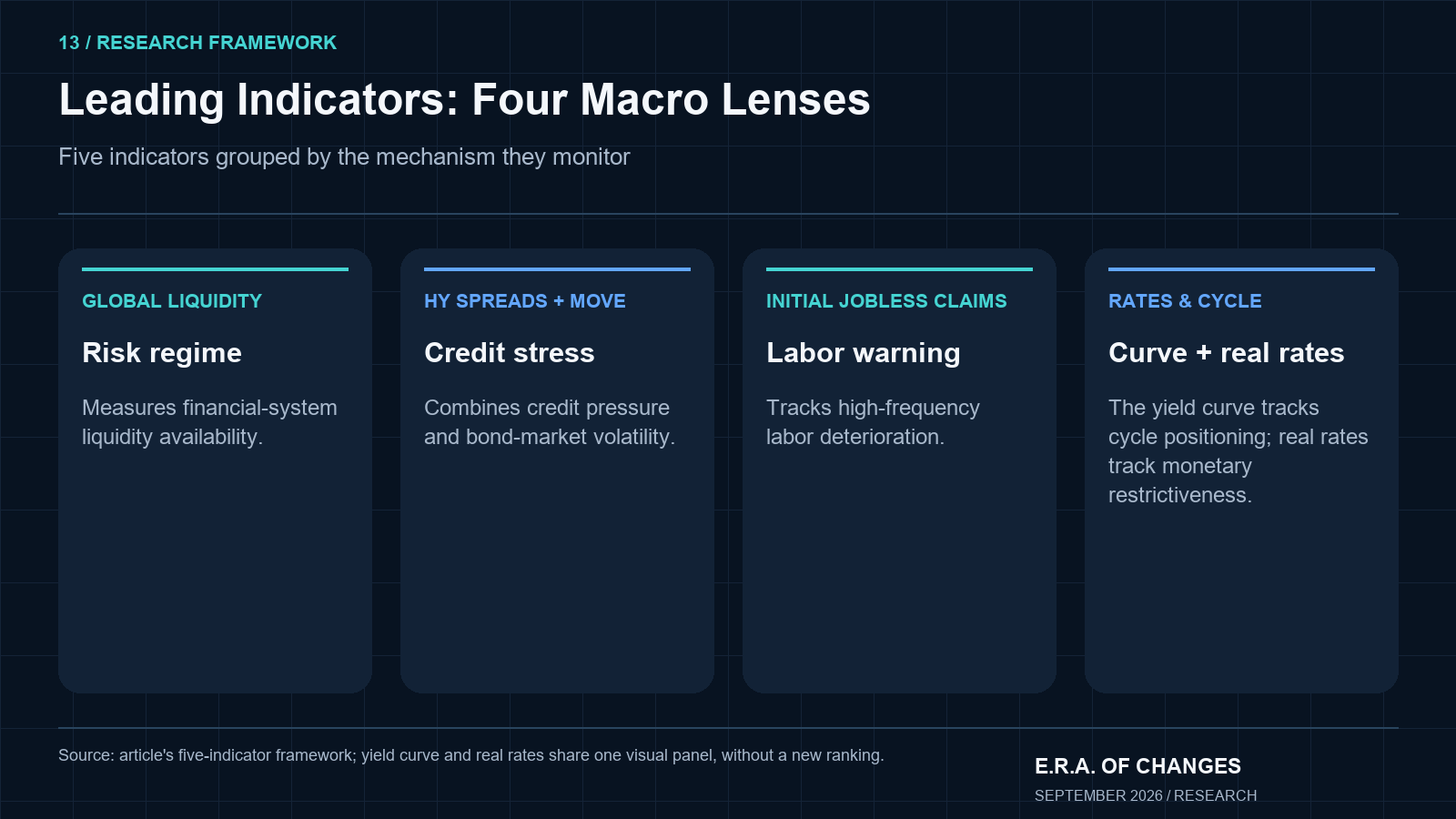
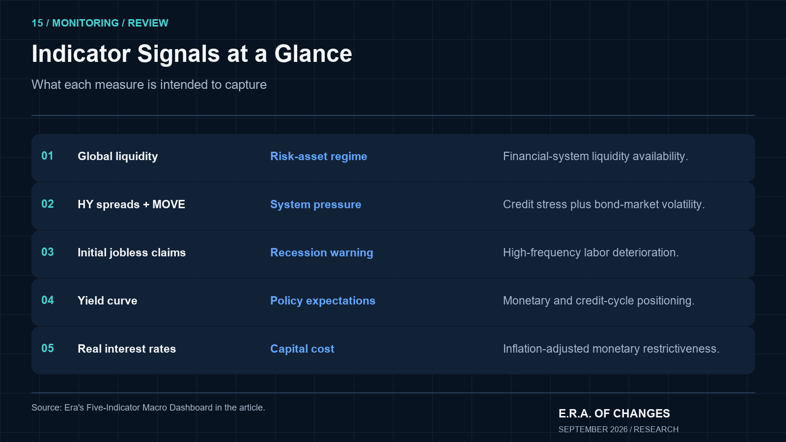
The Top 5 at a Glance
Rank | Indicator | What It Measures | Main Market Signal |
|---|---|---|---|
1 | Global Liquidity | Financial-system liquidity availability | Risk-asset regime direction |
2 | High-Yield Spreads + MOVE | Credit stress + bond-market volatility | Financial-system pressure |
3 | Initial Jobless Claims | High-frequency labor deterioration | Recession transition early warning |
4 | Yield Curve | Monetary and credit cycle positioning | Recession and policy expectations |
5 | Real Interest Rates | Inflation-adjusted cost of capital | True monetary restrictiveness |
The ranking reflects usefulness for forward-looking investors, not the general economic importance of each statistic. GDP is more economically consequential than initial jobless claims. Initial jobless claims are more useful for early market positioning.
#1. Global Liquidity: Era’s Most Important Indicator
If I could monitor only one macro variable over the next six months, it would be global liquidity. That is not a hedge or a qualification; it is a considered judgment about what drives the regime that governs everything else.
Here is the core argument. Financial asset prices do not move primarily on the immediate trajectory of corporate earnings. They move on multiples. And multiples (the price investors are willing to pay per dollar of earnings) expand when liquidity is available and contract when it is not. A company with excellent fundamentals, strong cash flows, and competent management can still see its valuation compress materially if systemic liquidity is withdrawing. The earnings did not change. The discount rate and risk appetite changed. And both are driven by liquidity conditions at the system level.
When I refer to global liquidity, I mean a composite picture that includes the combined balance sheets of the Federal Reserve, European Central Bank, Bank of Japan, and Bank of England, the four major central banks that together held approximately $24 trillion in assets as of early 2026. As of September 16, 2026, the Federal Reserve’s balance sheet stood at $6.747 trillion, comprising $4.554 trillion in Treasuries, $1.914 trillion in mortgage-backed securities, and $279 billion in other assets. The Fed has been reducing that balance sheet through quantitative tightening, and in September 2026 added a 25-basis-point rate hike on top of that contraction.
Beyond raw balance-sheet size, Era also monitors the Federal Reserve’s reverse repo facility. When money flows into the reverse repo (when money-market funds park cash overnight at the Fed rather than deploying it elsewhere), those funds are technically not circulating in short-term markets. The dynamics of the reverse repo balance, Treasury cash accounts, bank reserves, and private credit creation together determine whether financial-system liquidity is expanding or contracting in practice, not just on paper.
The simple equation “RRP balance falls → stocks go up” is too crude. What matters is the direction and magnitude of the aggregate liquidity pulse across all these channels simultaneously, and what that means for the marginal availability of risk capital.
Era’s current reading: global liquidity is contracting. The Fed balance sheet is declining. The Fed just hiked rates. The M2 Money Supply article explains how monetary aggregates interact with financial conditions in more detail.
Why Liquidity Drives Crypto as Well as Equities
One of the most consistent empirical patterns in the post-2017 period is the sensitivity of Bitcoin and the broader crypto market to the global liquidity cycle. When central-bank balance sheets expanded aggressively in 2020–2021, crypto valuations reached levels that seemed disconnected from any fundamental framework. When the Fed began contracting its balance sheet in 2022, crypto fell faster and harder than equities. The relationship is not mechanical or perfectly timed, but the directional correlation between global liquidity and crypto is one of the strongest in macro investing.
For equity investors, the assets most sensitive to the liquidity cycle are long-duration growth equities (companies whose value is concentrated in cash flows many years in the future) and small-caps, which depend more heavily on financing conditions to fund operations. Bitcoin Cycles covers the crypto angle in detail. The lesson for both asset classes is the same: when assessing valuation, do not start with earnings. Start with the liquidity environment that will determine the multiple applied to those earnings.
#2. High-Yield Credit Spreads + the MOVE Index
This is the indicator combination that most retail investors are not monitoring, and it may be the one that provides the earliest structural warning when financial conditions begin to deteriorate.
Nikolai’s exact observation from the interview: when high-yield spreads start widening, it is the first signal that credit mechanisms in the system have broken. Long before this shows up in the S&P 500. Let me explain precisely why that is true.
What High-Yield Credit Spreads Actually Measure
A high-yield credit spread measures the additional yield investors demand for holding speculative-grade corporate debt instead of a government bond of equivalent duration. The ICE BofA US High Yield Index Option-Adjusted Spread is the standard reference; as of September 18, 2026, that spread stood at 268 basis points.
When spreads are narrow (say, below 350 basis points, as they are today), investors are relatively comfortable with the default and refinancing risk embedded in lower-rated corporate borrowers. When spreads begin widening toward 400, 500, or 600 basis points, investors are demanding significantly more compensation for the same credit exposure. That repricing almost always means one thing: somewhere in the system, the credit transmission mechanism is under stress.
Bond investors and equity investors react to stress through different lenses. An equity investor asks: how much can this company’s earnings grow? A bond investor asks: can this company repay the principal? When refinancing risk or default probability begins rising, bond investors reprice first, because their return is entirely dependent on the answer to that second question. Equity investors may continue to hold while the credit market is already signaling that the cost of capital has changed.
What the MOVE Index Tells You
The MOVE Index (Merrill Lynch Option Volatility Estimate) measures implied volatility in the U.S. Treasury market. It is often described loosely as the bond-market equivalent of the equity VIX. When the MOVE is elevated, Treasury market participants are pricing significant uncertainty around the future path of interest rates. When it is low, rates expectations are anchored and Treasury pricing is stable.
A rising MOVE by itself does not confirm a credit crisis. Rates can be volatile for entirely benign reasons: a shift in inflation expectations, a policy communication surprise, technical Treasury-market dynamics. What matters is the combination.
HY Spreads | MOVE Index | Era Interpretation |
|---|---|---|
Narrow | Low | Financial conditions calm; risk appetite healthy |
Narrow | High | Rates volatility present, but limited credit contagion |
Widening | Low | Corporate-specific credit stress; watch carefully |
Widening | High | Broader systemic stress warning; financial conditions deteriorating |
The bottom-right quadrant (widening spreads combined with a rising MOVE) is where Era’s CrisisMeter begins to register elevated systemic risk. It has historically appeared before major equity drawdowns in 2008, 2015–16, early 2020, and 2022. It is not always followed by a full recession. But it is a signal worth taking seriously long before the S&P 500 has confirmed the move.
Era Analyst’s Perspective
Credit markets are the bloodstream of the economy. When the bloodstream is functioning properly, companies refinance, roll over debt, and extend credit lines without friction. Equity investors rarely think about this because the friction is invisible during good conditions. But the moment that smooth operation begins to fail (when a below-investment-grade issuer discovers its upcoming bond maturity can only be refinanced at 400 basis points above what it paid three years ago), the cascade begins in credit, quietly, before it shows up anywhere near the front page.
The ICE BofA HY OAS at 268 basis points as of September 18, 2026 tells me the bloodstream is still functioning. That is the reassuring reading. But the combination of a Fed that just raised rates 25 basis points in September, a 10-year TIPS yield at 2.63%, and a global liquidity environment that is clearly contracting creates the preconditions for spread widening. It has not arrived yet. That is precisely why I watch it now rather than after it happens.
The reason most retail investors miss the HY spread signal is that it requires following a market they do not invest in. Very few retail portfolios include speculative-grade corporate bonds. But the signal those bonds send (about access to capital, refinancing risk, and default expectations) is directly relevant to every equity position in their portfolio.
— Nikolai Fainizky, CEO & Senior Analyst, Era of Change
#3. Initial Jobless Claims: The Labor Signal to Watch First
The unemployment rate is one of the most reported statistics in economic journalism. It is also one of the least useful for forward-looking investment positioning. By the time the unemployment rate reaches 5% (a level that typically signals a weakening labor market in the official data), hiring has been slowing for months, hours worked have declined, and the first meaningful wave of layoffs is already captured in weekly jobless-claims data.
Initial jobless claims are reported every Thursday by the U.S. Department of Labor for the prior week. They represent the number of workers filing for unemployment insurance for the first time. As of the first week of September 2026, initial claims came in at approximately 206,000, slightly below market expectations. The four-week moving average remained well under 220,000, consistent with a labor market that is still functioning normally. For context, initial claims hit a near-60-year low of 189,000 in mid-July 2026.
Era’s analytical threshold (not an official recession definition, but a level that warrants elevated attention) is a sustained weekly claims reading above approximately 300,000. That level has historically been associated with meaningful labor-market deterioration, and it represents roughly a 50% increase from the current 206,000 baseline. We are not there today. The claim is that when you see it approaching that threshold on a sustained four-week moving average basis, you have earlier warning than the unemployment rate will provide.
The transmission mechanism matters. Layoffs reduce household income. Reduced income slows consumption. Slower consumption weakens corporate revenue. Weakened revenue produces further cost-cutting. At that point, a soft landing becomes self-reinforcing on the downside. Initial claims often signal that first step before the second, third, and fourth have occurred. How Recessions Are Measured covers the official recession-dating methodology, and why official data comes too late for investors who need to act before the NBER makes its declaration.
#4. The Yield Curve: Watch the Re-Steepening, Not Just the Inversion
Most investors know that an inverted yield curve (when short-term Treasury yields exceed long-term yields) has historically been a reliable recession warning. The 10-year minus 2-year Treasury spread inverted in July 2022 and remained inverted through most of 2024. As of September 22, 2026, the 2-year yield stands at 4.75% and the 10-year at 4.96%, giving a spread of approximately +0.21 to +0.46% depending on the observation date. The curve has returned to normal, barely.
Here is what most yield-curve commentary misses. The re-steepening after a prolonged inversion can be as significant a signal as the original inversion. And the direction of the re-steepening matters enormously.
A bear steepening occurs when long-term yields rise faster than short-term yields, often driven by inflation concerns, fiscal risk, or rising term premium. This is what happened in portions of 2023 and 2025, and it reflects market concerns about the government’s ability to finance its debt at sustainable rates. A bull steepening occurs when short-term yields fall faster than long-term yields, typically as markets begin pricing Federal Reserve rate cuts ahead of a recession. Bull steepening often follows a prolonged inversion when credit conditions begin to crack.
The inverted curve returning toward a normal positive slope is not automatically a green light for risk assets. It requires asking why the curve is re-steepening. The Yield Curve Explained article covers the full mechanism, including why the historical recession lead time for yield-curve signals has varied from six months to over two years, a range wide enough to be functionally dangerous as a timing tool without additional confirmation.
Era’s current reading: the yield curve is modestly positive at +0.21 to +0.46%. The re-steepening from a prolonged inversion is a meaningful development, but the specific driver (bear or bull) needs to be confirmed against the simultaneous trajectory of the MOVE Index, HY spreads, and initial claims before drawing a conclusion. This is why a single-indicator framework always fails and an integrated dashboard does not.
#5. Real Interest Rates: The True Cost of Money
Nominal interest rates tell you what you will receive in dollars. Real interest rates tell you what you will receive in purchasing power. A 5% nominal Fed funds rate means entirely different things if inflation is 2% versus 6%. In the first case, real rates are significantly restrictive. In the second case, monetary policy is barely keeping pace with prices.
The practical measure Era uses is the 10-year TIPS yield (Treasury Inflation-Protected Securities), which directly reflects the market’s real yield expectation over the next decade. As of September 21, 2026, the 10-year TIPS yield stood at 2.63%, the highest level in approximately 18 years.
That number deserves to sit for a moment. A 2.63% real yield means that capital invested in 10-year government bonds will earn 2.63% above inflation over the holding period. For any risky asset to compete for that capital (equities, high-yield bonds, real estate, private credit), it must offer a return premium above 2.63% in real terms. High-duration growth equities, whose value depends heavily on discounting future cash flows, are particularly sensitive to this calculus. Higher real rates make those distant cash flows worth less in present-value terms. The compression is mathematical, not sentiment-driven.
The How Interest Rates Affect Markets article covers the full equity-valuation transmission in detail. For the current environment: 2.63% real yields are significantly restrictive monetary conditions. Whether equity markets fully reflect that restrictiveness depends on whether earnings growth is strong enough to offset the higher discount rate, which is why real rates and corporate profit trends must be read together, not in isolation.
The Most Overrated Macro Indicator: CPI
I want to spend a moment on CPI because the way it is used in financial media gets something structurally wrong, and fixing that mistake changes how you interpret an enormous amount of market movement.
CPI is enormously important. It influences Federal Reserve policy, bond yields, currency values, and equity valuations. I am not suggesting you should ignore it. I am suggesting you should stop treating it as a leading indicator of the economy.
CPI is, by construction, a backward-looking measure. The Bureau of Labor Statistics collects price data from thousands of outlets during the prior month, applies seasonal adjustments, processes the results through a weighted basket of goods and services, and publishes the result roughly two weeks after the reference period ends. The number you see on the screen is a description of what prices did in the past. It is not a prediction of what they will do next.
This is what I mean when I call it the rear-view mirror of macroeconomics. Looking at October’s CPI to understand where the economy is going in Q2 of next year is structurally the wrong exercise.
What markets are actually trading when CPI prints is not the inflation number itself. They are trading the expected Fed response: how a CPI surprise changes the projected path of real interest rates, which changes bond yields, which changes equity discount rates, which changes valuations. The full chain runs: CPI surprise → expected Fed reaction → real-rate expectations → bond yields → equity multiples. CPI can move markets within minutes while still being a lagging description of the underlying economy.
The indicators that tend to lead CPI (that provide earlier information about where inflation is heading) include wage growth trajectories, shelter and rent pricing, commodity prices, supply-chain input costs, freight and shipping rates, and inflation expectations embedded in the TIPS market. What Causes Inflation covers these transmission channels in detail. The Inflation Forecast H2 2026 article applies that framework to the current U.S. cycle. The practical takeaway is to use CPI as a policy input to process into a real-rate expectation, not as a standalone forecast of the economy.
Era’s Five-Indicator Macro Dashboard
Indicator | Risk-On Signal | Neutral | Risk-Off Signal | Current Reading |
|---|---|---|---|---|
Global liquidity | Expanding | Stable | Contracting | Contracting: Fed QT + Sep rate hike |
HY spreads + MOVE | Narrow/low | Mixed | Both rising | Mixed: spreads 268bps (calm); MOVE elevated |
Initial jobless claims | Stable/declining | Gradual rise | Sustained acceleration | Stable: ~206K, well below 300K threshold |
Yield curve | Healthy normalization | Slightly positive | Stress-driven steepening | Slightly positive: +0.21 to +0.46%; re-steepening after inversion |
Real rates | Supportive | Stable (1–2% TIPS) | Restrictive (2.5%+) | Restrictive: 10Y TIPS 2.63% |
Dashboard updated: September 23, 2026. Update monthly.
Reading the current dashboard as a composite: global liquidity is contracting, real rates are at a level that is genuinely restrictive, and the yield curve has barely returned to positive territory after a prolonged inversion. Labor and credit are not yet showing stress. This pattern (liquidity and real-rate headwinds without a corresponding break in credit or labor) is what Era’s framework characterizes as late-cycle conditions. The system is under pressure that has not yet transmitted into the indicators that lag. Whether it does depends on the evolution of the leading signals.
Three Market Regimes
Regime 1. Healthy Risk-On
Liquidity expanding, HY spreads narrow, MOVE contained, initial claims low or declining, real rates supportive or falling. Financial conditions are broadly supportive. This was the environment of 2020–2021 and portions of early 2024.
Regime 2. Late-Cycle Warning
Liquidity slowing or contracting, real rates elevated, yield curve recently inverted or barely positive, initial claims beginning to drift higher, but credit markets still relatively calm. Underlying pressure is building but no systemic break has occurred yet. Era’s current reading places September 2026 in this regime.
Regime 3. Credit Event
Liquidity contracting materially, HY spreads widening above 400–500 basis points, MOVE rising simultaneously with spreads, initial claims accelerating toward or above 300,000, yield curve bull-steepening as markets price emergency easing. This is the regime where the Era CrisisMeter would register elevated systemic risk scores, and where Scenario Planning for Investors frameworks become immediately relevant.
The value of monitoring the five-indicator dashboard continuously is not that it predicts the exact transition from Regime 2 to Regime 3 with precision. It is that it prevents investors from being surprised by a regime shift that the leading signals had been warning about for months.
A 10-Minute Weekly Macro Check
Making this framework practical matters. Here is the process Era recommends.
Step 1. Check Global Liquidity. What direction is the combined G5 central-bank balance sheet moving on a four-week trend? Is the Fed’s reverse repo facility expanding or contracting? Are financial conditions tightening or loosening?
Step 2. Check Credit. What is the ICE BofA US HY OAS doing week over week? Is there a trend in spread widening across multiple weeks, or is this a one-week noise event?
Step 3. Check Bond Volatility. Is the MOVE Index confirming or contradicting what the credit market is doing? A rising MOVE with widening spreads is a much stronger signal than either in isolation.
Step 4. Check Labor. What did this week’s initial jobless claims print? What is the four-week moving average doing? Is continuing claims also rising, which would confirm that the unemployed are having difficulty finding new positions?
Step 5. Check Rates and the Curve. What is the 10-year TIPS yield doing relative to its recent range? Is the 10-year minus 2-year spread normalizing, flattening, or steepening, and in which direction?
Step 6. Only Then Interpret CPI and GDP. Use headline data to understand the macro environment and the likely Fed reaction function. Do not use it as the primary input to a forward-looking market view.
The entire review takes under ten minutes if the data sources are organized. The discipline is in executing it consistently, in both quiet markets and volatile ones.
Common Mistakes When Reading Economic Indicators
Watching the level instead of the rate of change. Markets react to acceleration and deceleration more than to absolute levels. Initial claims at 206,000 for six consecutive months is a stable labor market. Initial claims rising from 206,000 to 280,000 over six weeks is an inflection, regardless of whether 280,000 is still low by historical standards.
Treating one data point as a trend. A single CPI miss, a single week of elevated jobless claims, or a one-day MOVE spike are not regime changes. The signals that matter are sustained directional shifts confirmed across multiple weeks and ideally across multiple independent indicators.
Ignoring revisions. GDP and employment data are routinely revised, sometimes by amounts large enough to reverse the original interpretation. Initial claims can be distorted by temporary factors including seasonal adjustment errors, natural disasters, and strikes. The trend across four to eight weeks is more reliable than any single print.
Confusing market-moving with leading. CPI is the perfect example. It moves markets because it drives Fed reaction-function expectations. That does not make it a leading indicator of the economy. These are different properties.
Waiting for GDP confirmation. GDP is published with a two-month lag and is subject to multiple revisions. If your investment framework requires GDP confirmation of a slowdown before you act, you are likely acting on prices that already reflect what the leading indicators told the market six months earlier.
How Era Uses Leading Economic Indicators
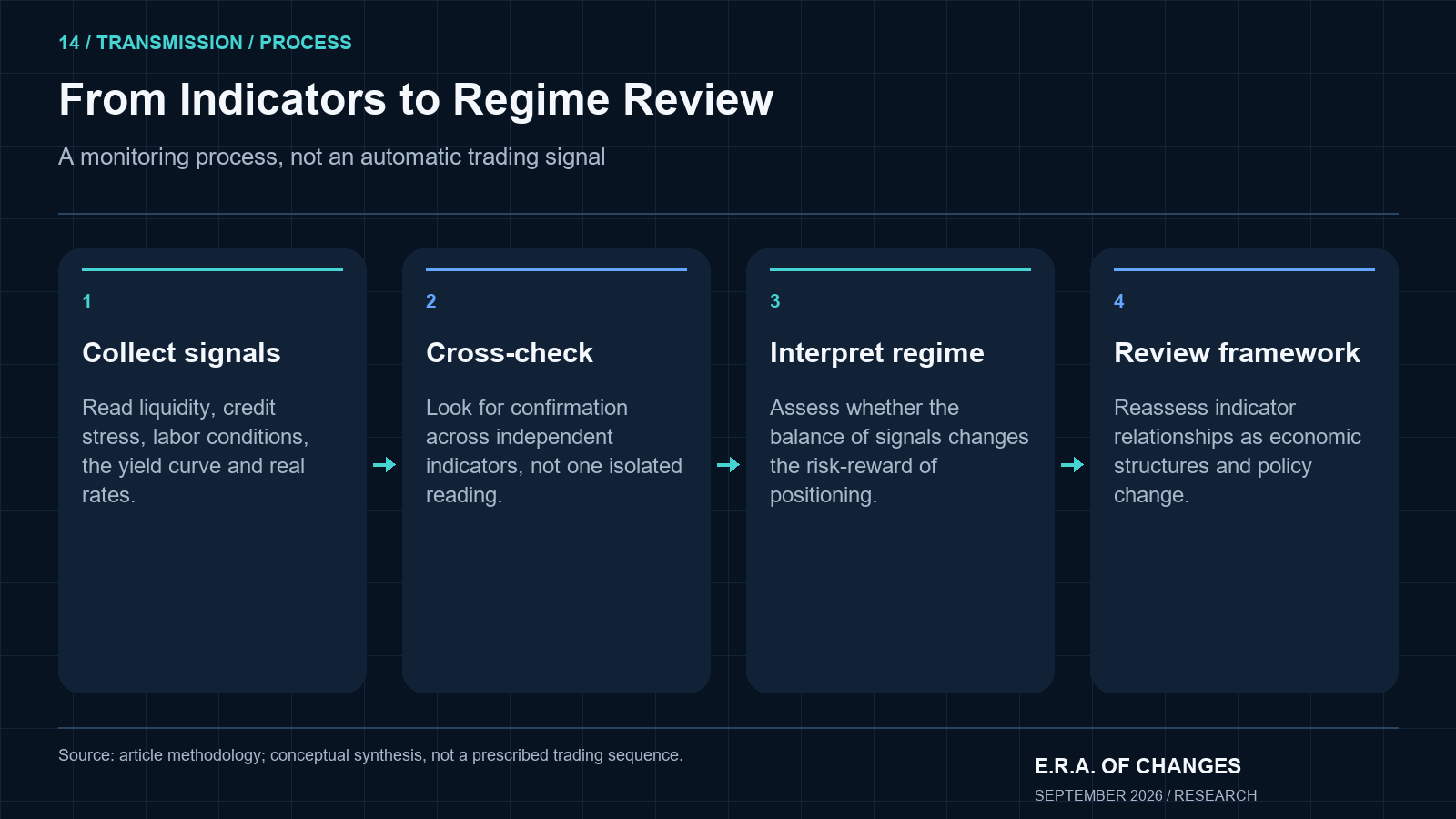
Era’s process is not to identify one leading indicator and act on it mechanically. The framework is: observe the indicator’s direction → identify the current macro regime → cross-check against independent signals → compare against historical analogues → confirm liquidity direction → assess market positioning → build scenario with explicit invalidation conditions.
The Era Forecasting Methodology article covers how this process is systematized and documented. The Era Global Risk Index (updated daily from 24 structural indicators) runs a continuous version of this five-indicator logic across the full range of Era’s data inputs. The goal is not to predict the exact turning point. It is to identify when the balance of leading-indicator signals has shifted materially enough that the risk-reward of current positioning has changed.
Era should also note a structural limitation: indicator relationships do not remain stable forever. The Conference Board’s Leading Economic Index has had to revise its component weights multiple times because the historical lead properties of specific indicators weakened as the economy’s structure changed. Era monitors whether the indicators in its framework are producing consistent signals across cycles, and will update the framework when empirical evidence suggests a relationship has broken down.
Frequently Asked Questions
What are leading economic indicators?
Leading economic indicators are data series or market variables that tend to change direction before broader economic activity, employment, credit conditions, or asset prices reach an important turning point. They are used by investors and analysts to identify potential shifts in the economic regime before those shifts become visible in lagging statistics such as GDP, the unemployment rate, or CPI.
What are the most important economic indicators for investors?
Era’s five-indicator framework prioritizes global liquidity, high-yield credit spreads combined with the MOVE Index, initial jobless claims, the yield curve, and real interest rates. These five are selected because they tend to signal changes in the financial transmission mechanism (access to capital, credit conditions, labor deterioration, monetary regime) before those changes are fully captured in official economic statistics.
What are the top macro indicators to watch right now?
As of September 23, 2026, Era’s highest-priority indicator is global liquidity: the Federal Reserve’s balance sheet stands at $6.747 trillion and is contracting through quantitative tightening, with an additional 25-basis-point rate hike in September 2026. The 10-year TIPS real yield is at 2.63%, the highest in approximately 18 years. HY credit spreads at 268 basis points remain relatively calm, which means the credit signal is not yet confirming the liquidity and real-rate headwinds. That combination defines Era’s current late-cycle reading.
Which economic indicator predicts recessions best?
No single indicator has a perfect track record. The combination Era considers most reliable is a simultaneous deterioration across multiple leading signals: liquidity contraction, HY spread widening above 400 basis points, initial claims accelerating toward 300,000 on a sustained basis, and yield-curve bull steepening. When three or more of these five indicators are deteriorating simultaneously, the probability of a significant economic slowdown in the following six to twelve months has historically been elevated. Era’s Global Recession Probability analysis uses this multi-indicator framework.
Why is global liquidity important?
Liquidity determines the multiple investors are willing to pay for a dollar of earnings. When liquidity is expanding, risk appetite grows, valuations expand, and both equities and crypto tend to benefit. When liquidity contracts (as it is currently doing through Fed balance-sheet reduction and rate increases), multiples compress, the cost of capital rises, and even companies with strong fundamentals can face valuation pressure. Liquidity is the variable that makes the difference between a market that shrugs off bad news and one that amplifies it.
What are high-yield credit spreads?
A high-yield credit spread is the additional yield investors demand for holding speculative-grade corporate debt rather than government bonds of equivalent duration. The ICE BofA US High Yield Index Option-Adjusted Spread (the standard reference) stood at 268 basis points as of September 18, 2026. When this spread widens, investors are demanding more compensation for credit risk, which typically signals that the credit transmission mechanism is under stress. Wide spreads (above 400 to 500 basis points) have historically been associated with recession and significant equity market drawdowns.
What is the MOVE Index?
The MOVE Index measures implied volatility in the U.S. Treasury market. It functions as a bond-market counterpart to the equity VIX, reflecting uncertainty around the future path of interest rates, Treasury pricing, and monetary policy. A high MOVE reading by itself indicates elevated rates uncertainty. When a rising MOVE coincides with widening high-yield credit spreads, it signals broader financial-system stress: the combination Era watches most closely.
Why do jobless claims matter?
Initial jobless claims provide high-frequency, weekly visibility into the labor market’s trajectory. The unemployment rate is published monthly and reflects labor conditions with a lag. Initial claims report the number of workers filing for unemployment insurance for the first time, giving investors a faster signal of whether layoffs are accelerating. Era monitors both the weekly print and the four-week moving average, and considers sustained readings above approximately 300,000 as an important early-warning threshold, well above the 206,000 recorded in early September 2026.
What does an inverted yield curve mean?
An inverted yield curve (when short-term Treasury yields exceed long-term yields) has historically been a reliable forward indicator of recession. It typically reflects market expectations that the current restrictive monetary policy will slow economic growth enough to force future rate cuts. As of late September 2026, the 10-year minus 2-year spread is modestly positive at approximately +0.21 to +0.46%, having re-steepened after a prolonged inversion. The direction and cause of that re-steepening (bear steepening driven by fiscal concerns, or bull steepening driven by recession expectations) matters significantly for the interpretation.
What are real interest rates?
Real interest rates represent the nominal interest rate adjusted for inflation expectations. The 10-year TIPS yield (currently 2.63% as of September 21, 2026) is the standard market measure of the 10-year U.S. real rate. A high positive real rate means capital invested in government bonds earns a meaningful return above inflation, increasing the competition for risk-asset capital. High real rates are generally a headwind for equities, gold, and other non-yielding assets. Low or negative real rates reduce the opportunity cost of holding risk assets and typically support valuations.
Is CPI a leading or lagging indicator?
CPI is primarily a lagging indicator. It measures price changes that have already occurred, using data collected during the prior month and processed through a statistical methodology that introduces additional delay. What CPI does lead (and why markets react to it so intensely) is not economic activity but Federal Reserve policy expectations. A CPI surprise shifts the expected path of real interest rates, which shifts bond yields, which shifts equity discount rates. The causal chain passes through policy reaction, not through the underlying economy. For forward-looking economic analysis, indicators such as wage growth, shelter costs, commodity prices, and TIPS-market inflation breakevens tend to provide earlier information.
Is GDP a leading economic indicator?
No. GDP is published with a two-month lag, is subject to multiple revisions, and aggregates economic activity that financial markets have typically already begun to price. Markets often turn before GDP confirms the slowdown. The NBER, which officially dates U.S. recessions, typically makes its determination months after the economy has already entered contraction. For investment positioning purposes, GDP is useful for confirming what the leading indicators had already signaled, not for anticipating what comes next.
Which macro indicator does Era consider most important right now?
As of September 2026, Era’s highest-priority variable is global liquidity: specifically the trajectory of G5 central-bank balance sheets combined with key Federal Reserve liquidity-facility dynamics. The Fed balance sheet stands at $6.747 trillion and is contracting. The September 2026 rate hike added to that tightening. Equity and crypto valuations are ultimately determined by the multiple investors apply to cash flows and future expectations, and that multiple is most directly governed by the liquidity environment. When liquidity is contracting at scale, fundamental analysis alone cannot reliably protect valuations.
About Era of Change
Era of Change is an independent macroeconomic research and geopolitical intelligence firm providing institutional-quality analysis to investors worldwide. Our research combines macroeconomics, financial markets, blockchain analytics, and geopolitical risk into proprietary forecasting frameworks designed to identify structural market trends before they become consensus. The Era Global Risk Index (updated daily from 24 structural indicators) serves as the foundation of our analytical methodology, providing a forward-looking measure of systemic financial stress grounded in structural economic evidence rather than market sentiment. Our full methodology, live index reading, and forecast archive are available at eraperemen.info/en.
The content published by Era of Change is for informational and educational purposes only and does not constitute financial, investment, legal, or tax advice. All views expressed are the personal analytical perspective of the author. Past forecast accuracy does not guarantee future results. Readers should conduct their own research and consult a qualified financial professional before making any investment decisions.
Sources
Global Liquidity and Central Banks - Federal Reserve: H.4.1 Balance Sheet Release, September 17, 2026 - Federal Reserve Board: Recent Balance Sheet Trends - DataSetIQ: Central Bank Balance Sheets, Tracking Global Liquidity Across Fed, ECB, BOJ, and BOE
Credit Spreads - FRED (St. Louis Fed): ICE BofA US High Yield Index Option-Adjusted Spread (BAMLH0A0HYM2) - GovSpending: High-Yield Credit Spread (OAS), 2.68%
Real Yields and Monetary Policy - TIPSWatch: 10-Year TIPS Reopening Gets Real Yield of 2.653%, Highest in Nearly 18 Years (September 17, 2026) - FRED (St. Louis Fed): Market Yield on U.S. Treasury Securities at 10-Year Constant Maturity, Inflation-Indexed (DFII10)
Yield Curve - MacroRadar: Yield Curve (10Y-2Y Spread) Today, September 2026 - FRED (St. Louis Fed): 10-Year Treasury Constant Maturity Minus 2-Year Treasury Constant Maturity (T10Y2Y)
Initial Jobless Claims - U.S. Department of Labor (Employment and Training Administration): Unemployment Insurance Weekly Claims Data - FRED (St. Louis Fed): Initial Claims (ICSA)
Economic Research - Federal Reserve: The Central Bank Balance-Sheet Trilemma (January 14, 2026)
— Nikolai Fainizky, CEO & Senior Analyst, Era of Change